|
This is the functional mascot for the the spiffy new bar/restaurant on Upper King, 710 to be exact. I favored adding some lettering or text, but that would have been a violation of the City's strict sign ordinance. I just like having that other layer.... see below.
1 Comment
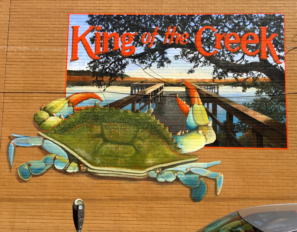
This is my most recent mural. It's on the side of the Crab House restaurant located at Charleston's Market on the State St. side. It was not terribly difficult to get through the City's approval process with the condition that the owner remove a cartoon crab painted above their entry. Because of the city's sign ordinance, I could not use the restaurant's name on the mural, but as I often feel, some text would make it a better piece. Particularly, because the inspiration for the piece was the graphic art on fruit and produce crates. The building was used by a produce wholesaler in the 1950's and the produce was unloaded from the train tracks just on the side of this wall. Both the composition and the retro typeface were derived from the hundreds of produce labels I looked at on the internet. It's wonderful to be able to access all the images, but I never actually copy anything preferring to re-interpret the feel of the originals.
With this stroke I'm finally having intercourse with the American mainstream, web presence! My good friends at the tech company, Blue Key, and host to one of my murals (http://www.bluekeyinc.com/boatwright.php) have facilitated this deed and I'm grateful for their savvy guidance. At the moment, I'm showing the bulk of my exterior and interior work around Charleston SC over the last decade or so. Eventually, I plan to set up links to some of my films and videos and feature some of my residential design work as well.
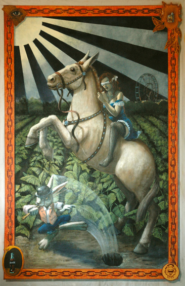
Recently, I developed a new project for an exterior mural in Charleston's market area. It's awaiting approval by the Board of Architectural Review, and billboard-style mural for Pabst which seeks to extend the vibe of Charleston's Alley mural. While these projects percolate through the system, I'm putting together new paintings and silk screens for a show in the not too distant future. As the world turns...... 56” x 100”, Acrylic on canvas
“Trick Rider” is one of a series of paintings of archetypal women placed in a Southern landscape. Although the image is laden with symbolic imagery, there is no literal explanation for the whole painting. It simply cannot be boiled down to a simple narrative statement. Contrarily, it is not just a random collection of images, either. The process of my studio-produced paintings is fundamentally different from my approach to mural painting. Murals are, by necessity, well worked out in advance. Paintings, on the other hand, begin in the studio from a fragment of an idea, an image, a thought, or a starting point that goes through multiple phases with images added and discarded as it seeks to find its authentic identity—one that comports with the original intention. To me, a successful painting has to work on several levels. It should have elements of humor or sexual tension or a political sense or all three, and it must be painted in a way that supports the subject. 19’ x 34’, 68 1/2 Queen St., Charleston SC
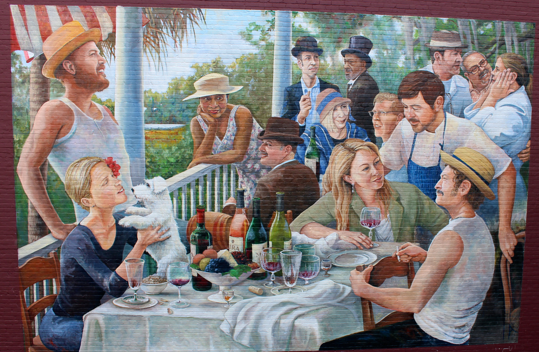
This mural, “Renoir Redux”, was done for Mira Wines, a Napa Valley winery whose head office and tasting room are located in Charleston. Renoir Redux typifies the form many of my large-scale projects usually take. Mira Winery had a new building with a highly-visible wall and wanted a mural to make a statement announcing their presence. They didn’t have a concept in mind when we first met—merely the need for something to convey the quality of their product. At the same time, the mural could not be a sign or any kind of blatant commercial reference. It was left up to me to come up with an idea and sketches to illustrate a concept fitting their needs. Sometimes pursuing the very first idea that pops into my mind is the way to go, but in this case it took a more oblique route. The company had been experimenting with submerging cases of their high-quality wine 60 feet deep in Charleston harbor, and they received quite a bit of press about this technique. At first, It seemed like I should create an underwater scene with a shark or marine creatures nestled up to the wine cases, but the idea didn’t wear well and didn’t really convey the sophisticated classicism of their wine. While in this meandering state, I realized that the site was very close to Charleston’s fine arts museum. That got me thinking that a fine art reference was the perfect vehicle for celebrating the idea of fine wine and food. What better image that Renoir’s “Luncheon of the Boating Party” could convey that? Of course, the 19th century painting needed to convey a connection to Charleston, so I used some of the luminaries from the local food world in lieu of the original cast and placed the Mira bottles on the table. 8’ x 60’, 274 Huger St., Charleston SC
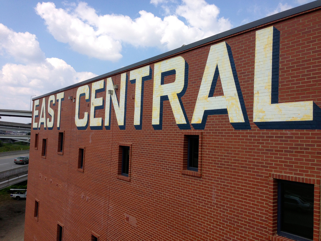
The East Central Lofts sign was commissioned while the building was still under construction. The clients had a general notion of what they wanted, but the exact placement and typeface was left up to me. We all wanted to recall the era when brick buildings were routinely named by large hand-painted signs that could be seen from far away. The letters are ivory colored, but I added a little yellowing in an uneven way to suggest aging. This is as straightforward of a sign as it gets, and that, to me, is what makes sign painting a satisfying enterprise. You take a concept through the design phase, and then it becomes all about the execution. Even though I strive for perfection in the execution, it is never perfect. Paradoxically, the slightly imperfect, hand-painted nature of the sign is what makes it so much more appealing than a digitally-produced version could ever be. |
|
 RSS Feed